The Green Room Co. roots lie in bespoke joinery & internal fit out’s.
Services:
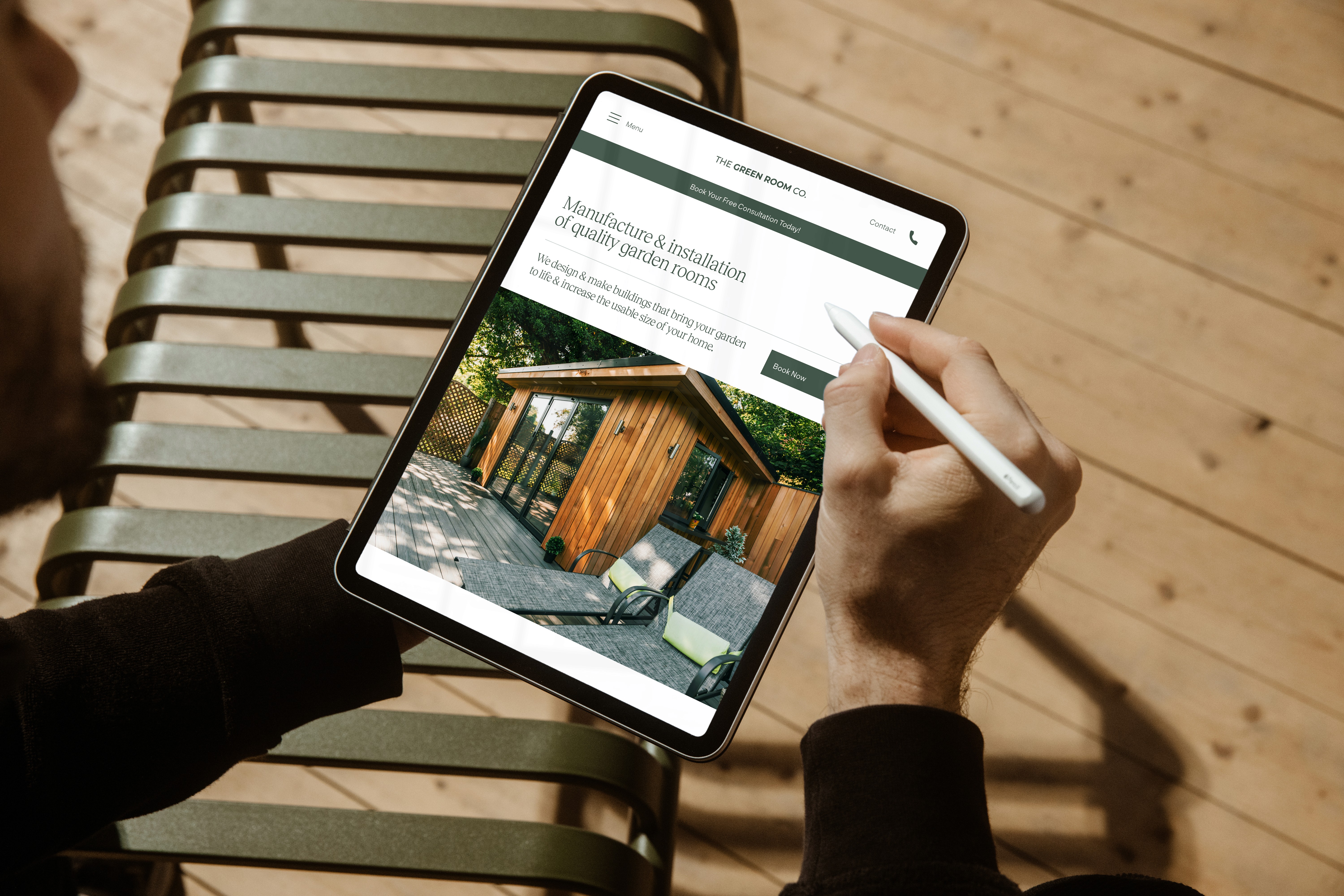
Web
Web
Client:
The Green Room Co.
The Green Room Co.
Year:
2024
2024

Project Overview
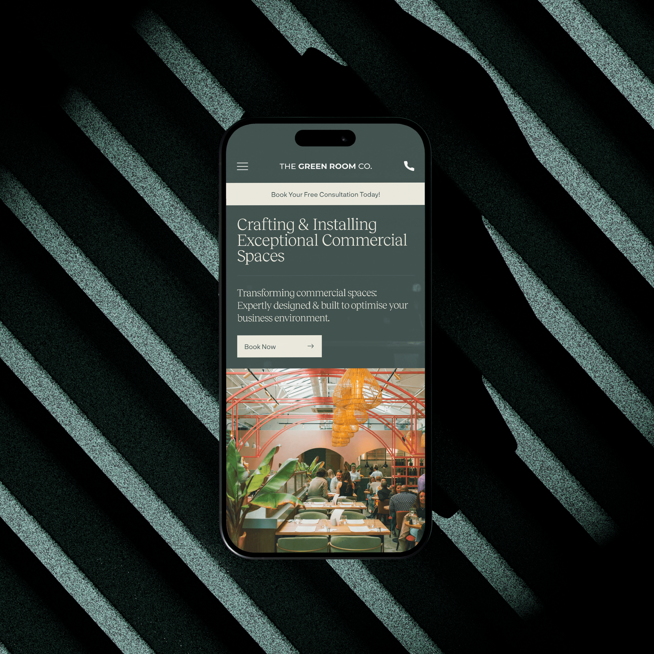
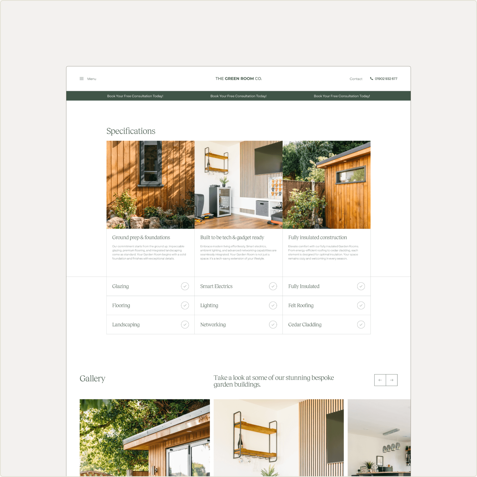
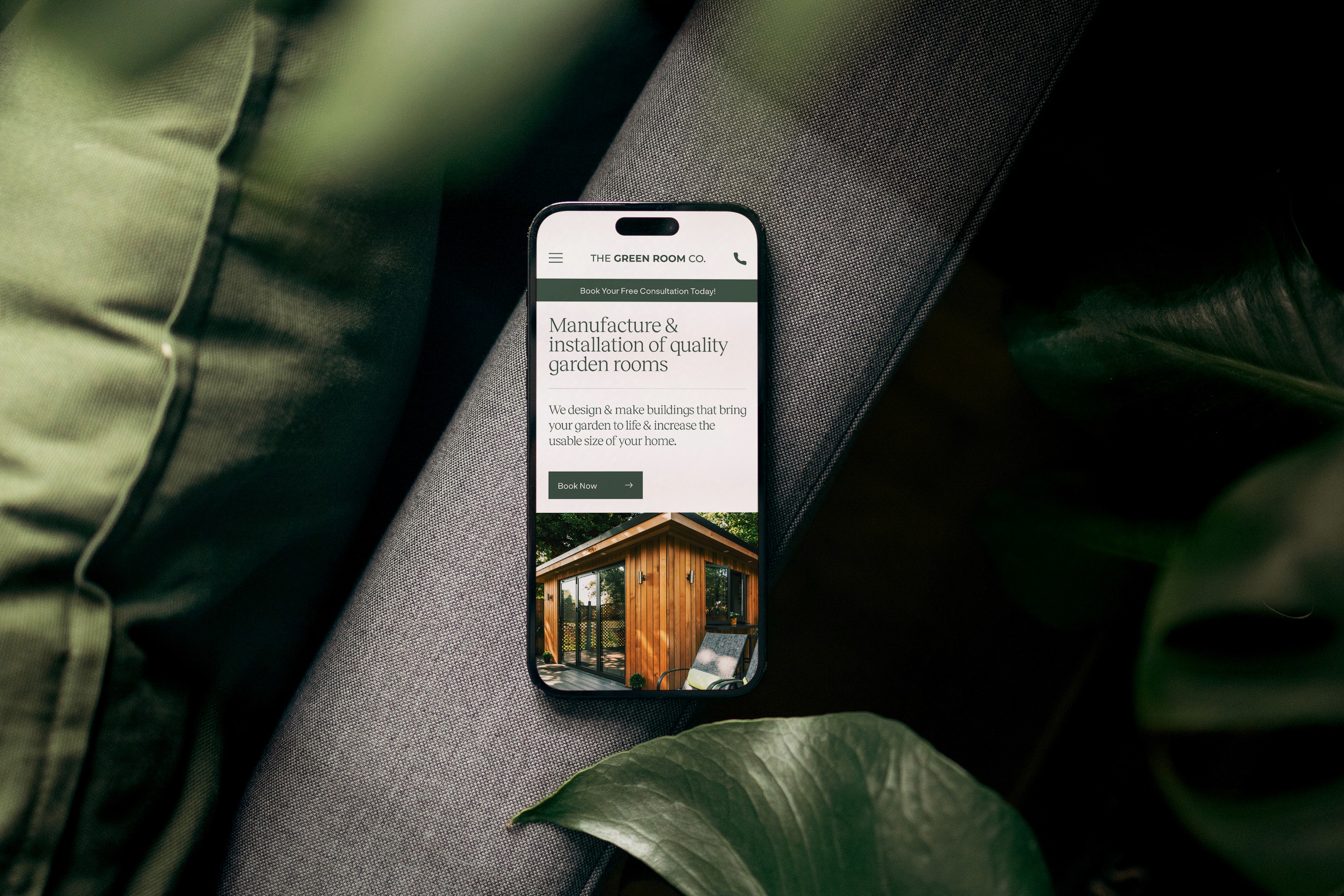
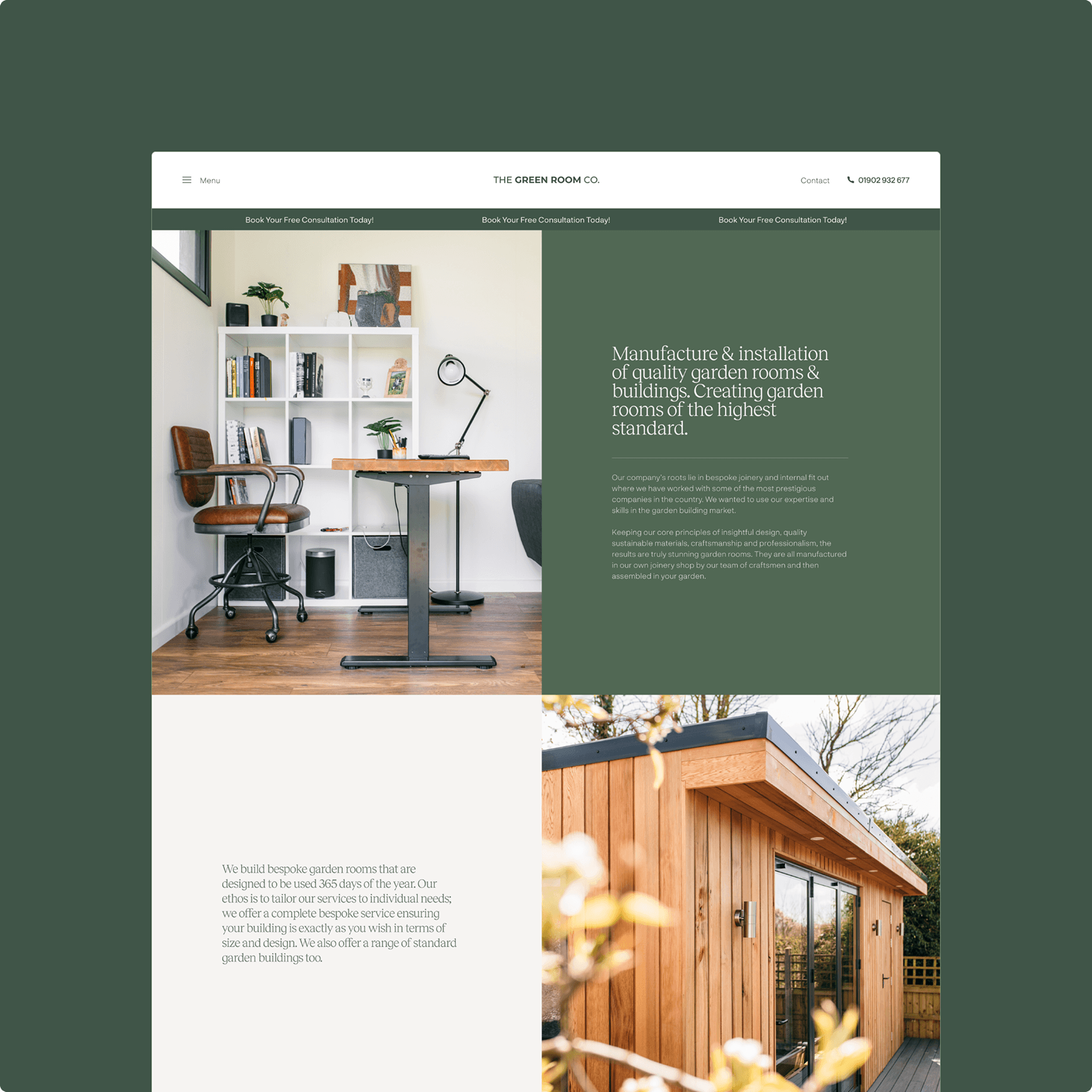
The Green Room Co. needed a new website that reflected their core principles while showcasing the quality and craftsmanship behind their bespoke garden rooms. A key focus was capturing the product in a way that could communicate the level of detail and care that’s immediately apparent in person.
I worked on the design of the website, developing a modern, spacious layout that allowed the photography and product details to take centre stage. The result was a calm, considered digital experience that mirrors the brand’s focus on thoughtful design and high-quality construction.
Project Overview
The Green Room Co. needed a new website that reflected their core principles while showcasing the quality and craftsmanship behind their bespoke garden rooms. A key focus was capturing the product in a way that could communicate the level of detail and care that’s immediately apparent in person.
I worked on the design of the website, developing a modern, spacious layout that allowed the photography and product details to take centre stage. The result was a calm, considered digital experience that mirrors the brand’s focus on thoughtful design and high-quality construction.